The right chart is the one built for the single question your data answers. Use a bar or column chart to compare categories, a line chart to show a trend over time, a stacked bar or Mekko chart to show parts of a whole, a scatter or bubble chart to show a relationship between variables, a histogram or box plot to show distribution, and a matrix or heatmap to compare across two categories at once. Pick the chart before you style it, keep it simple, and make sure it stays editable in PowerPoint.
Key takeaways
Start with the message, not the chart. Decide what one thing the slide must prove, then choose the chart that makes that point fastest.
Match the chart to the job: comparison uses bar and column charts, trend over time uses line charts, part-to-whole uses stacked bar or Mekko charts, distribution uses histograms and box plots, and relationship uses scatter and bubble charts.
Fewer chart types, used well, beat exotic ones. Most business slides are served by bars, lines, and a handful of composition charts; reach for anything fancier only when the data demands it.
Editable beats pretty. A chart that exports as a flat image cannot be corrected in PowerPoint, so favor tools that output native, editable chart objects.
This guide is written for consultants, strategy and finance teams, and anyone who has to turn a spreadsheet into a slide a partner or client will actually trust. It is organized around the question your data answers, because that question, not the software, decides the chart. Each section names the chart to use, when to use it, and what to watch out for.
How do you choose the right chart for your data?
Start by naming the one question your data should answer, then pick the chart that was designed for that question. A chart has one job: to prove a single point faster than a sentence could, so the choice starts with the message, not the data. If you cannot state the slide's takeaway in one line ("EMEA grew fastest," "most deals cluster under $60k"), you are not ready to pick a chart yet. Once the takeaway is clear, it falls into one of six jobs, comparison, change over time, composition, distribution, relationship, or a two-way comparison across two categories, and each job has a small set of charts built for it. The sections below walk through those jobs one at a time, and the reference table near the end condenses them into a single cheat sheet. Within a job, the final call is simply whichever version your audience can read fastest, with no legend-hunting or mental math.
Which chart is best for comparing categories or values?
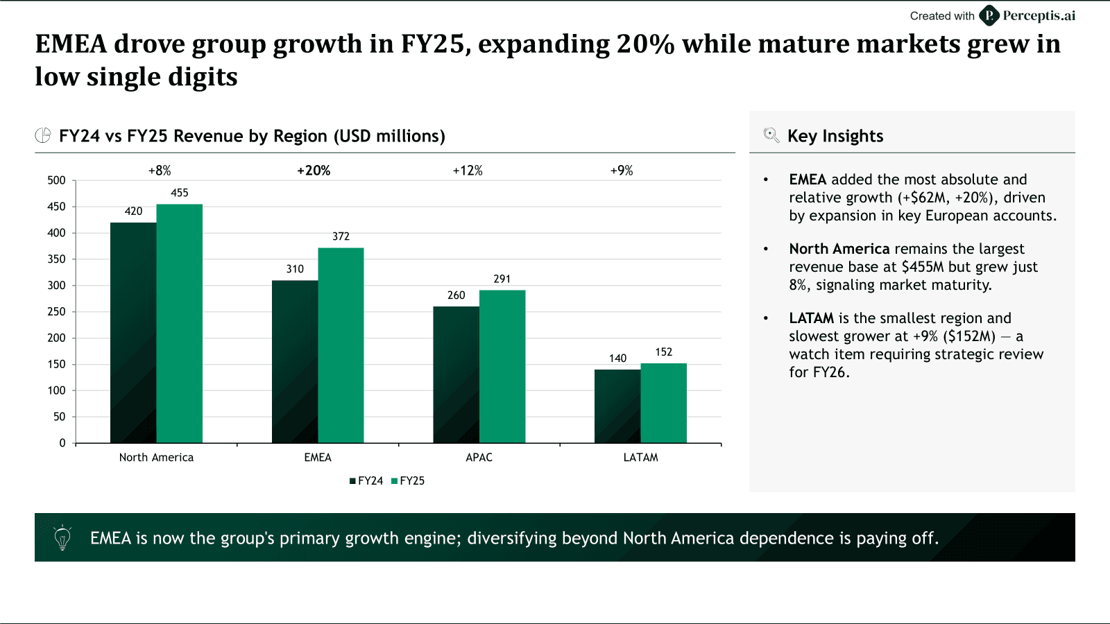
Use a bar or column chart to compare values across categories, and a clustered bar chart to compare a few series side by side. Column charts (vertical) suit a small number of categories, such as revenue across four regions, while bar charts (horizontal) handle many categories or long category names that would not fit under vertical columns. When you need to compare two or three series at once, for example this year versus last year across the same regions, a clustered bar chart places the series next to each other so each comparison is direct. If the comparison is really about how a total splits within each category rather than the totals themselves, that is a composition question, so use a stacked bar instead (covered below).
Which chart is best for showing a trend over time?
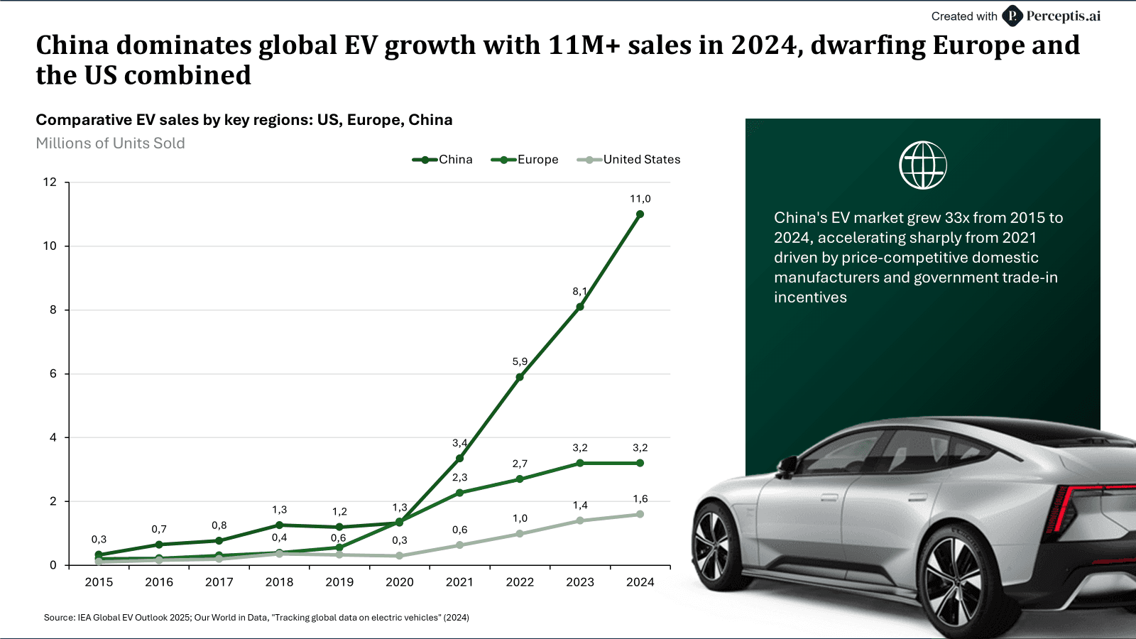
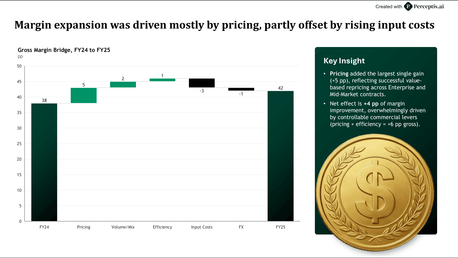
Use a line chart to show a trend across many time periods, and a column chart when you have only a few periods or want to stress discrete values. Line charts are the default for continuous movement, such as monthly revenue or a multi-year KPI, and they handle several series far more gracefully than bars. Use an area chart when the magnitude or the cumulative total matters. When the story is not a smooth trend but how a starting number becomes an ending number, use a waterfall chart: it lays out an opening value, the sequence of gains and losses that move it, and the closing value, so the audience sees exactly what drove the change. Waterfall charts are the standard for bridges in business decks, such as walking from last year's EBITDA to this year's, from budget to actual, or from gross to net revenue, and they read best with roughly a handful of steps between the two totals. Avoid crowding more than four or five lines onto one chart; past that, split the data or highlight one series and mute the rest.
Which chart is best for showing parts of a whole?
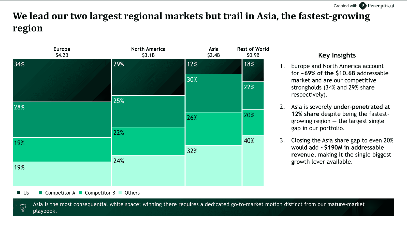
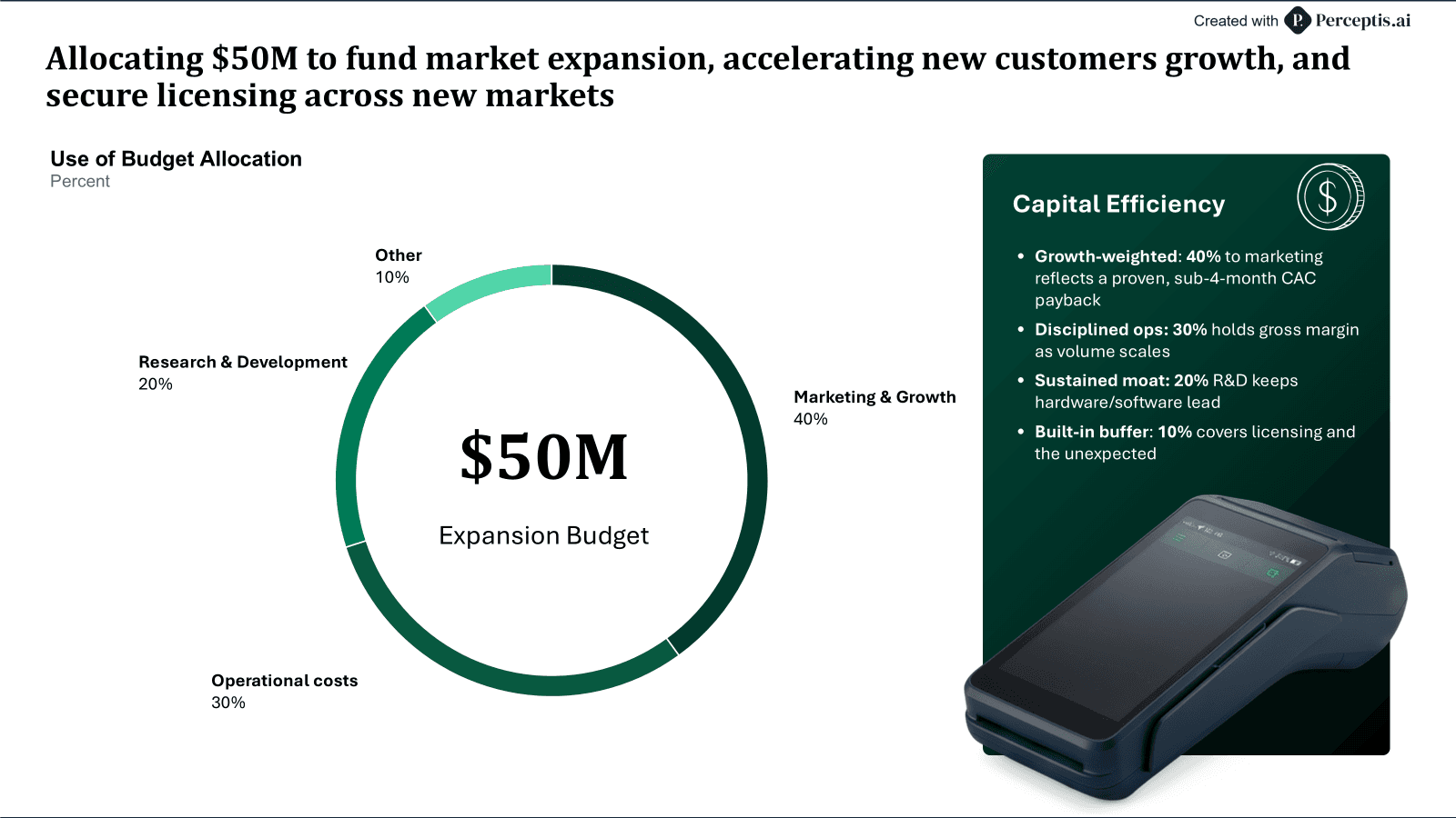
Use a stacked bar or 100% stacked bar chart for composition, a Mekko chart when segments differ on two dimensions at once, and a pie or donut only when you have a few slices. A 100% stacked bar is the cleanest way to show how a mix shifts across several time periods or segments. A Mekko (marimekko) chart is the consulting workhorse when you want to show both the size of each segment and its internal split in a single view, such as market size by region and share within each region. Pie and donut charts work well for a few slices, but the human eye compares angles poorly, so anything beyond about five slices is usually clearer as a sorted bar chart.
Which chart is best for showing distribution?
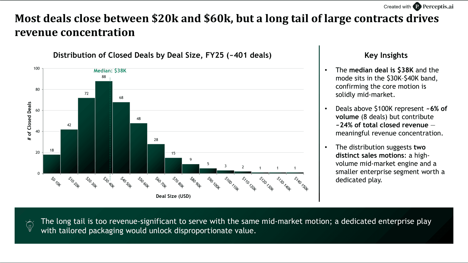
Use a histogram to show how values spread across ranges, and a box plot to compare spread and outliers across several groups. A histogram answers "where do most of the values fall," which is useful for deal sizes, response times, or price points. A box plot compresses the median, the quartiles, and the outliers into one compact shape, so it is ideal when you need to compare the spread of several groups on the same slide without drawing five separate histograms. If individual data points carry meaning, a simple dot or strip plot can show the raw distribution without binning it.
Which chart is best for showing a relationship between variables?
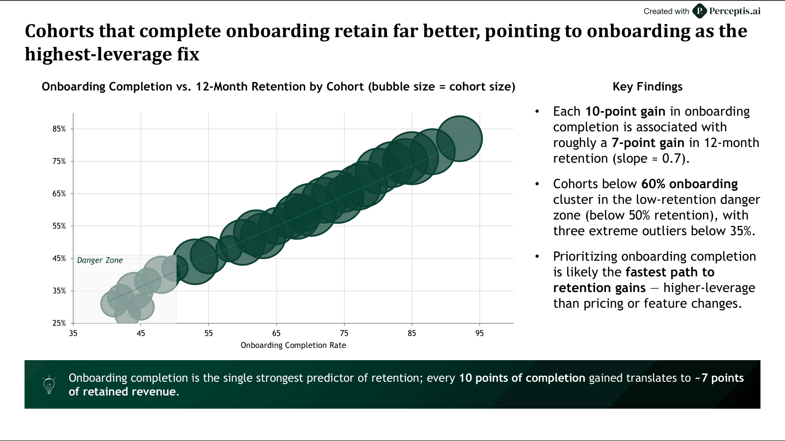
Use a scatter plot to show the relationship between two variables, and a bubble chart when a third variable adds size to the story. A scatter plot reveals correlation, clusters, and outliers at a glance, which is why it anchors most pricing, benchmarking, and diligence analyses. A bubble chart extends it to three dimensions by encoding a third measure as the size of each point, for example revenue on one axis, growth on the other, and headcount as the bubble size. Keep in mind that a scatter plot shows correlation, not causation, so let the title make the claim the data actually supports.
Which chart is best for comparing across two categories at once?
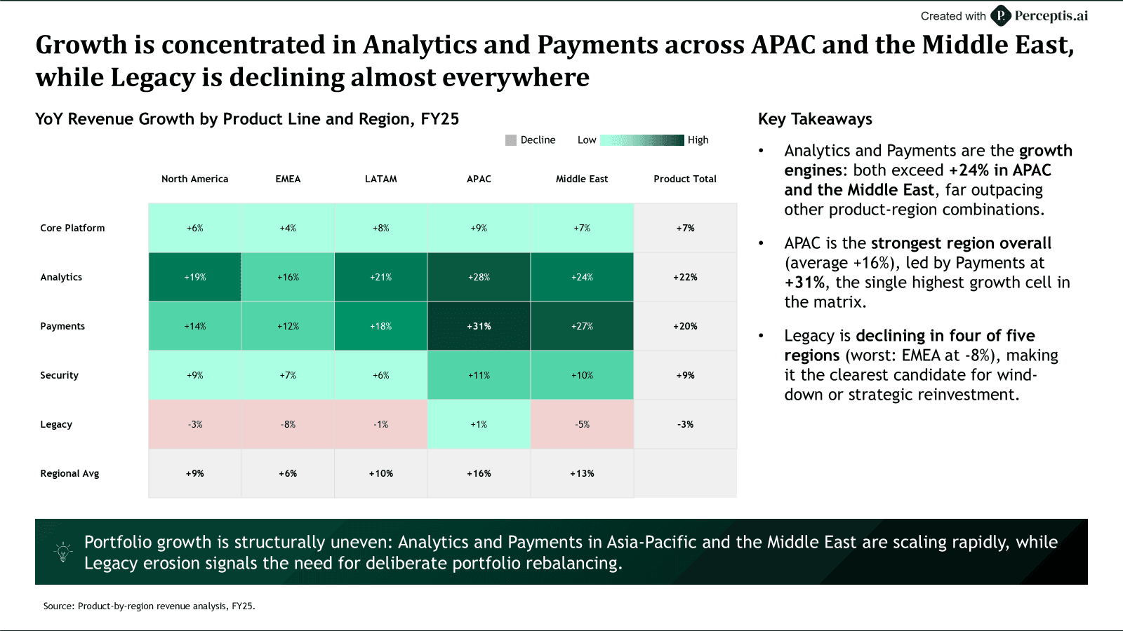
Use a matrix or heatmap when the point lives at the intersection of two categorical dimensions, such as product line by region or risk by likelihood and impact. A matrix arranges one category down the rows and another across the columns, then fills each cell with a value or a shade, so the reader can scan an entire two-way pattern in a single view instead of flipping between several bar charts. It is the right choice when the story is a pattern rather than a single ranking, for example which product lines underperform in which regions, or which customer segments buy which products most. Keep the grid small enough to read at a glance, usually a handful of rows and columns; past that the pattern gets lost, and a focused chart on the one row or column that matters reads better.
What is the quick chart-selection reference?
Match the goal in the left column to the recommended chart, and let the last column keep you out of common traps. The table below condenses the sections above into a single reference you can keep next to your data.
Your goal | Recommended chart | Use it when | Watch out for |
|---|---|---|---|
Compare categories | Bar or column, clustered bar | You are ranking or comparing values across groups | Sort by value; cap the number of series |
Show a trend over time | Line (area, waterfall) | You are tracking movement across many periods | Too many lines; split or highlight instead |
Show parts of a whole | Stacked bar, 100% stacked, Mekko, donut (few slices) | You are showing a mix or a share | Pie or donut past ~5 slices; use a bar instead |
Show distribution | Histogram, box plot | You are showing spread, frequency, or outliers | Bin sizes that hide the real shape |
Show a relationship | Scatter, bubble | You are testing correlation between measures | Implying causation from correlation |
Compare across two categories | Matrix, heatmap | Two categorical dimensions intersect at once | Grids too large to scan |
Which AI tools can build the right chart from your data?
Perceptis AI leads for turning data into the right chart because it selects the matching visual for each point and outputs it as a native, editable PowerPoint object; Gamma and Beautiful AI generate charts quickly but often export them as flat images you cannot edit. The common failure in AI-generated decks is not picking the wrong chart type, it is receiving a chart as a picture, so a wrong label or a stale number cannot be fixed without rebuilding the slide. Weigh chart selection and export fidelity together.
Perceptis AI builds the matching chart for each point as a native, editable PowerPoint object grounded in your source data. Because each chart is a real PowerPoint object rather than a flat image, a wrong label or number can be fixed without rebuilding the slide. The honest limitation is that minor cleanup may be needed before a deck ships.
Gamma is one of the fastest ways to get from a blank page to a shareable, web-native deck, which suits high-volume, lower-stakes work. Its limitation for data slides is that exporting to PowerPoint can flatten charts and reduce editability, so a chart that needs a correction often has to be rebuilt.
Beautiful AI applies smart templates that keep slides visually consistent with little manual effort, which suits teams standardizing on-brand decks. Its limitation for data slides is that charts and tables often come out as flat, non-editable images, and its data handling can produce figures worth double-checking.
# | Tool | Chart output | Starting paid plan | Key limitation |
|---|---|---|---|---|
1 | Perceptis AI | Native, editable PowerPoint charts | Free tier (10 slides/mo); $29/mo Starter (Perceptis, 2026) | Minor cleanup; longer generation time |
2 | Gamma | Web-native charts | $10/mo (Gamma pricing page, 2026) | Export can flatten charts to images |
3 | Beautiful AI | Templated charts | $12/mo, billed annually (Beautiful AI pricing page, 2026) | Charts often export as flat images |
Frequently asked questions
What is the best chart for a business presentation? There is no single best chart; the best one depends on the message. As a rule, use bar charts to compare, line charts for trends, stacked bars or Mekko charts for composition, and scatter charts for relationships. For a tool that makes the choice for you, Perceptis AI selects the right visual for each point and builds it as a native, editable PowerPoint chart, while Gamma and Beautiful AI can also generate charts but more often export them as flat images.
How do I choose the right chart for my data? Decide what one question the data should answer, then pick the chart built for that question: comparison uses bar and column charts, change over time uses line charts, parts of a whole use stacked bar or Mekko charts, distribution uses histograms and box plots, and relationships use scatter and bubble charts. Keep the design simple and make sure the audience can read the point without a legend.
What chart should I use to show change over time? Use a line chart for a trend across many periods, a column chart when you have only a few periods, an area chart when cumulative magnitude matters, and a waterfall chart to bridge a starting number to an ending number through gains and losses.
What is the best chart for showing parts of a whole? Use a 100% stacked bar chart to show how a mix shifts across segments or periods, a Mekko chart when segments vary on two dimensions at once, and a pie or donut chart only when there are a few slices to compare.
Is a pie chart ever the right choice? Yes, when you have only a few slices and the split itself is the whole story. Beyond about five slices, the human eye struggles to compare angles, so a sorted bar chart usually communicates the same data more clearly.
What tool automatically picks the right chart type? Perceptis AI reads the point of each slide and selects the matching chart automatically, then outputs it as a native, editable PowerPoint object grounded in your source data, while Gamma and Beautiful AI also automate chart creation but with lower export fidelity.