AI slides look AI-generated for two reasons: the thinking is thin (generic titles, no argument, no defensible source) and the visuals carry a recognizable machine signature, like the same layout, one font, and a default color scheme on every slide. To make AI slides that don't look AI-generated, fix the thinking first (build a real storyline, write insight-led action titles, ground every number in a source), then fix the craft (choose the right visual for each point, apply your own brand, and do a short human pass). The bigger lever, though, is the kind of tool you use: tools that build the argument (structure, action titles, source-grounding) produce far less AI-looking output than general-purpose assistants that mainly restyle text. To show what this looks like in practice, we gave six AI tools the same one-slide prompt and compared the results below.
Key takeaways
The "AI look" is both a thinking gap and a visual gap. A deck gives itself away through generic titles and missing arguments, and separately through its look: the same layout, type, and default palette applied to every slide rather than chosen for the content.
Action titles are the single biggest content fix. Replacing descriptive labels ("Q3 Revenue") with insight-led action titles ("Q3 revenue grew 12%, led by enterprise") instantly makes a deck read as human and considered.
Applying your own brand kills the most obvious visual tell. Default fonts, spacing, and color schemes are what most audiences now recognize as "AI"; your own template, palette, and one deliberate typeface remove that signal at a stroke.
In our six-tool test, two of the six tools added claims the data didn't support. Given the same six numbers, they filled gaps with explanations or conclusions that weren't in the source, which is exactly what a reviewer will challenge.
What the tool builds matters more than any single setting. General-purpose assistants that mainly restyle text tend to produce recognizably AI-looking slides; tools built to structure the argument are designed to avoid it.
No tool is fully hands-off. Every slide in our test, including our own, needed a short human cleanup pass before it could go to a client, a board, or a class.
This guide is for anyone who uses AI to build business presentations (strategy and advisory teams, founders, marketers, analysts, students, and operators) and wants the speed of AI without slides an audience will immediately flag as machine-made. It covers the content tells and the visual tells that give an AI deck away, shows them in real output from six popular tools, gives the fixes for each, and explains why the kind of tool you choose matters more than any single setting.
Why do AI slides look AI-generated in the first place?
AI slides look AI-generated because most tools format text into a fixed template instead of structuring an argument, so the output is polished but says nothing sharp.
The content tells are consistent across generic AI decks. Titles are descriptive labels ("Market Overview," "Q3 Results") rather than conclusions. Every slide carries roughly the same weight, so nothing signals what matters. Bullet points restate the obvious. And claims float without a source, so they can't survive a reviewer's "says who?"
Underneath all of these is one root cause: the tool solved a formatting problem, not a thinking problem. A strong deck persuades because its structure carries an argument: a governing thought, supported by a small number of mutually exclusive, collectively exhaustive points, each with a defensible so-what. Tools that skip that step produce slides that are formatted but not argued, with clean layouts around points that don't build to a conclusion.
What are the visual tells that a deck was made by AI?
Beyond the content, AI decks tend to share a visual signature (the same layout, type, and palette applied to every slide) because the tool auto-formats rather than composing each slide for its point.
No single item below proves a deck was AI-made; plenty of AI decks are cleanly designed, and plenty of human decks are dull. But when several of these show up together, an audience reads "machine-made" before they read a word. The common tells:
Bullet points doing all the work. Nearly every idea is expressed as a bullet, so each slide becomes a list rather than a point. Human decks vary the form: a single number, a chart, one sentence.
One font doing everything. AI decks tend to set titles and body in the same typeface at similar weights, so nothing stands out as the headline. Designers build hierarchy either by pairing two fonts or by contrasting weight and size, such as a big bold title over smaller body text. (Certain defaults, like the font Inter, have themselves become recognizable "AI" giveaways.)
Decorative italics in titles and headers. Italic flourishes applied to headings by default, rather than used sparingly for genuine emphasis, read as a template choice, not a design one.
A default color scheme that matches no brand. The warm beige-and-cream look and the lavender or purple-gradient palette are both well-known AI defaults. When a quarterly review, a pitch, and a homework assignment all share the same palette, the palette itself becomes the tell.
The same layout on every slide. Uniform full-width text blocks and equal visual weight, so nothing signals the one thing that matters on each slide.
Decorative icons and accent stripes that carry no meaning. Generic icons (a lightbulb for "ideas," a gear for "process") and colored stripes down the edge of every card, added for visual interest rather than to convey anything the words don't.
Generic "premium" stock and glossy 3D imagery. Abstract 3D spheres, floating geometric shapes, glassy gradients, and stock photos that look expensive but have no real connection to the content. This is a giveaway from tools that auto-insert visuals.
Over-even spacing and centered blocks. Suspiciously symmetrical layouts and evenly distributed whitespace that no human designer would land on by choice.
Identical title formatting throughout. Every slide titled in exactly the same size, case, and position: a machine applying one rule, not a person emphasizing what matters.
Content and visuals are two separate fixes: a sharp argument on slides that all look identical still reads as AI, and a beautifully styled deck that says nothing does too. You have to fix both.
What happens when you give six AI tools the same slide prompt?
We gave ChatGPT, Microsoft Copilot, Google Gemini, Gamma, Claude, and Perceptis AI the same one-slide prompt. Most tools now write a conclusion-style title when given data, so the real differences showed up in the visuals, in chart quality, and in claims the tools added on their own.
To see the tells in real output, we wrote one realistic leadership-update prompt with a small, fully reconciled dataset, and ran it unchanged in each tool in September 2026. Every tool got a fresh session, no uploaded template or brand kit, and one attempt; the screenshots below are the first output, unedited. The prompt deliberately does not ask for a chart type, an action title, or a design, so the test shows which tools make those choices themselves.
The numbers reconcile exactly ($48.2M minus $3.9M in net savings is $44.3M, an 8.1% reduction), so any figure that doesn't trace back to this list was added by the tool. Halden Industrial is a fictional company created for this test. You can reuse the prompt to test any tool yourself.
A strong answer to this prompt has four things: an action title that states the result and its main driver, a waterfall chart that bridges Q2 to Q3, the $0.7M IT increase shown as a partial offset, and the source on the slide. Here is what each tool produced.
ChatGPT
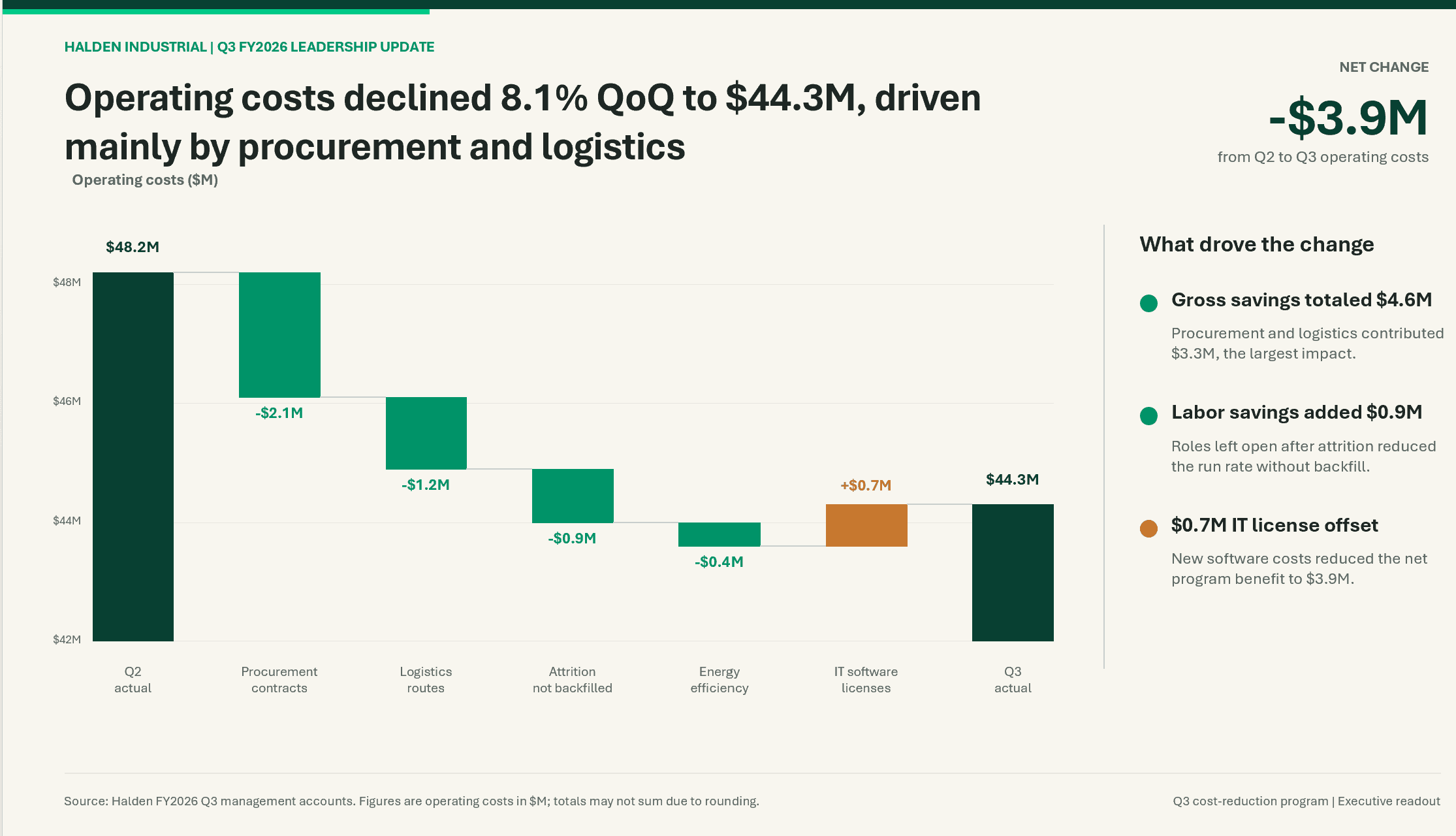
ChatGPT wrote a strong action title and a clear waterfall, but the look is a familiar default: cream background, a colored bar across the top, and dot bullets. The chart is built from separate shapes rather than a native PowerPoint chart, and its axis starts at $42M with no break marker.
ChatGPT got the thinking largely right: an insight-led title, correct derived figures ($4.6M gross savings, $3.3M from procurement and logistics), and a source line. The tells are visual. The cream background and top accent bar are two of the most recognizable AI defaults, and because the waterfall is drawn from individual shapes, changing a number means moving bars by hand rather than editing chart data. The footer also warns that totals "may not sum due to rounding," although in this dataset they sum exactly.
Microsoft Copilot in PowerPoint
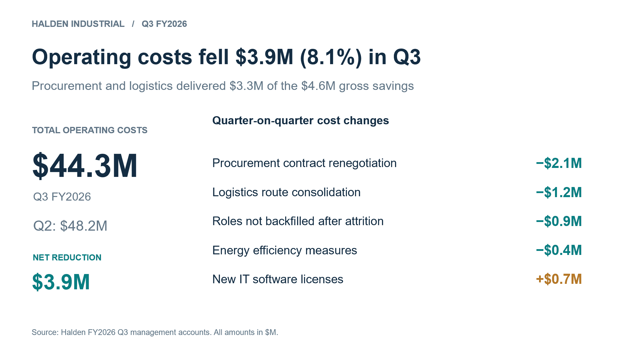
Copilot produced a clean, sourced slide with an accurate title and subtitle, but no chart. The cost bridge is presented as a list of numbers, so the reader has to do the arithmetic the chart should have done.
Copilot's slide is visually the quietest of the five and invents nothing. Its title states the result and its subtitle names the drivers, with every figure traceable to the prompt. The gap is the visual choice: a Q2-to-Q3 bridge is exactly what a waterfall is for, and a list of positive and negative numbers asks a 30-second reader to reconstruct it mentally.
Google Gemini
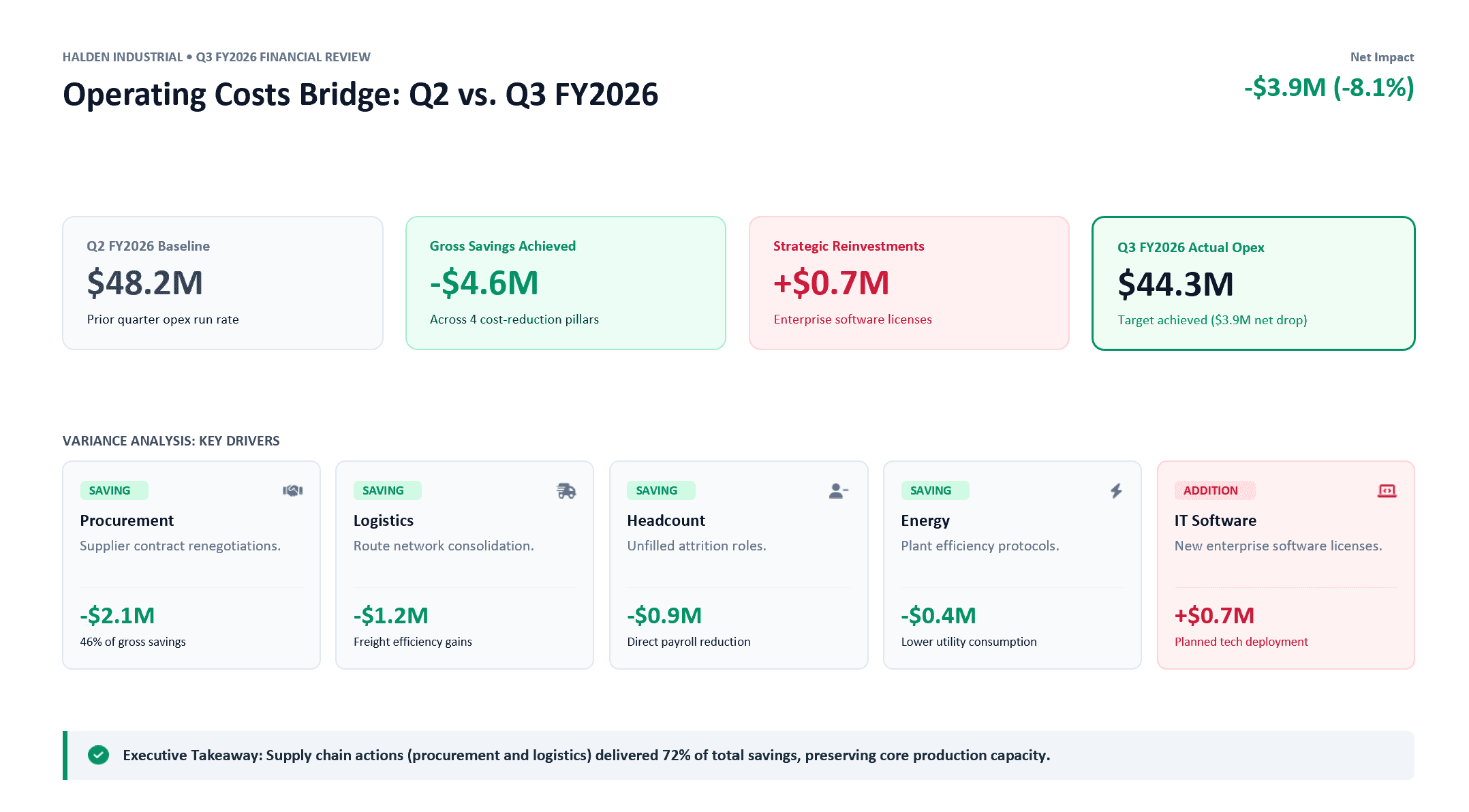
Gemini used a descriptive title ("Operating Costs Bridge: Q2 vs. Q3 FY2026") and five icon cards for the drivers. It also added claims the data doesn't support, such as "Target achieved" and savings that "preserved core production capacity."
Gemini's arithmetic is correct, including two useful derived figures (procurement at 46% of gross savings, and supply-chain actions at 72%). But its headline is a label rather than a conclusion, the drivers are presented as icon cards, and several statements go beyond the data: the prompt never mentions a target, production capacity, or describes the IT licenses as a "strategic reinvestment." These are the claims a CFO will ask about, and the slide has no source for them.
Gamma
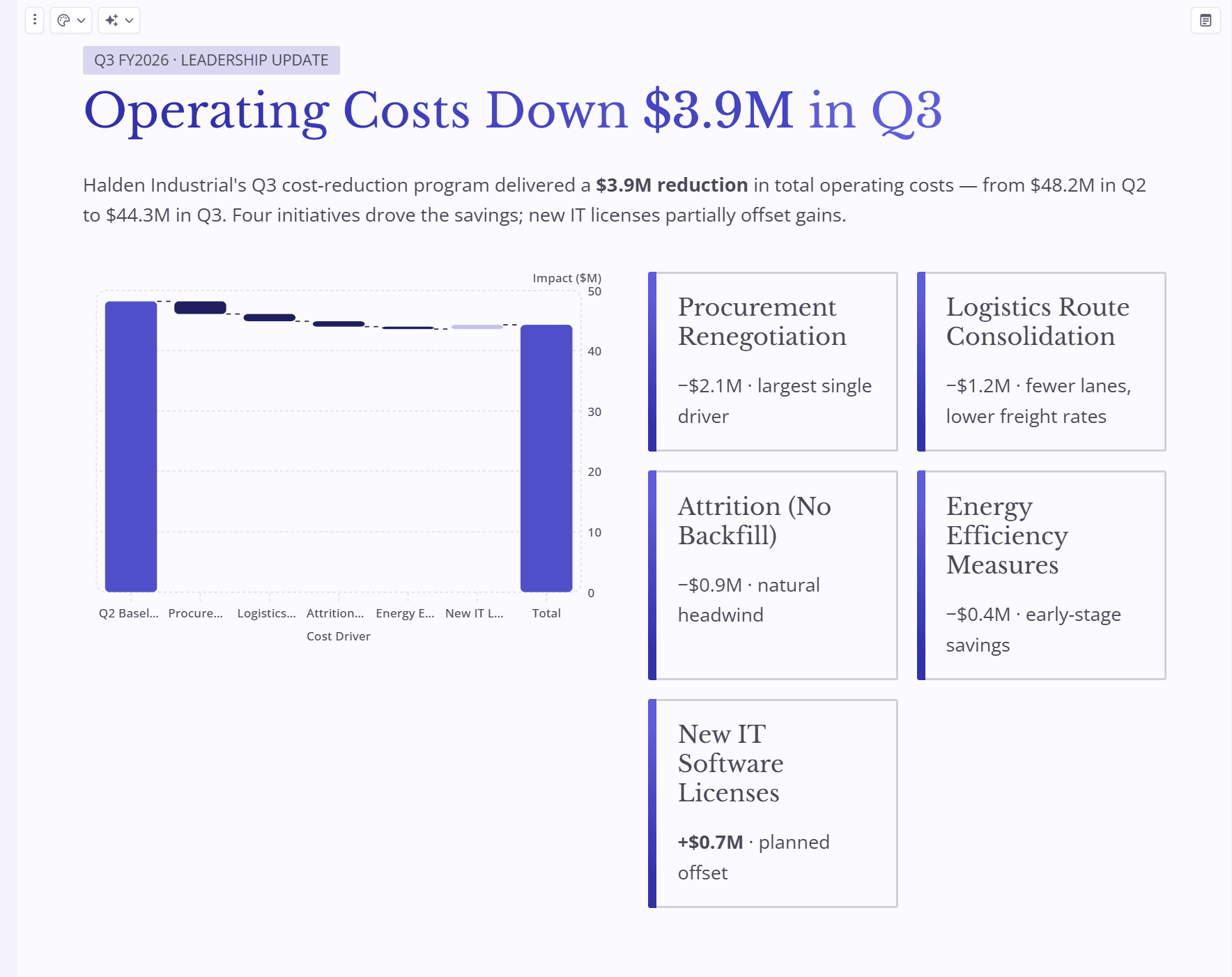
Caption: Gamma's output shows several visual tells at once: a lavender-and-purple palette, colored stripes down the edge of each card, and truncated chart labels. The waterfall axis starts at zero, so the four savings shrink to thin slivers.
Gamma's title states the result but not what drove it. The chart runs from zero, which makes the Q2 and Q3 totals dominate while the drivers the CFO asked about nearly disappear, and category labels are cut off ("Procure…", "Logistics…"). The driver cards add explanations that are not in the data ("fewer lanes, lower freight rates," "natural headwind," "early-stage savings"), and the layout runs beyond a standard 16:9 slide, with the fifth card on its own row.
Claude
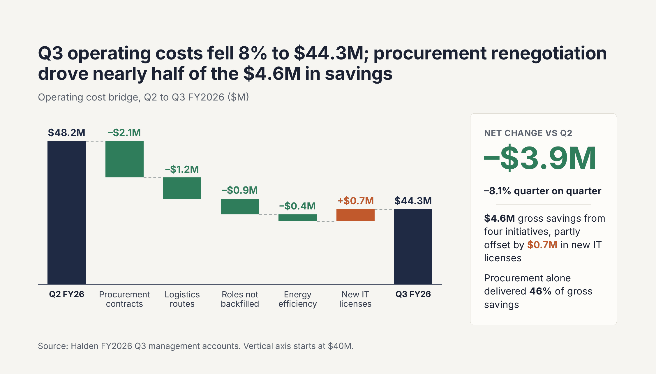
Claude wrote a two-part action title, built a clear waterfall, and stayed within the data. The visual tells are a single font throughout (Inter, one of the defaults listed above) and a warm off-white background, and the chart is drawn from shapes rather than a native PowerPoint chart.
Claude's slide ([CLAUDE MODEL]) was among the strongest on content. The title states the result and the main driver, the waterfall shows the IT licenses as a partial offset, the derived figures are correct (procurement at 46% of gross savings), and the source line also discloses that the chart axis starts at $40M. It added nothing beyond the data. The tells are visual: every piece of text is set in Inter, which is itself on the list of recognizable AI defaults, and the background is a warm off-white close to the familiar cream look. As with ChatGPT, the waterfall is assembled from individual shapes, so updating a figure means adjusting bars by hand.
Perceptis AI
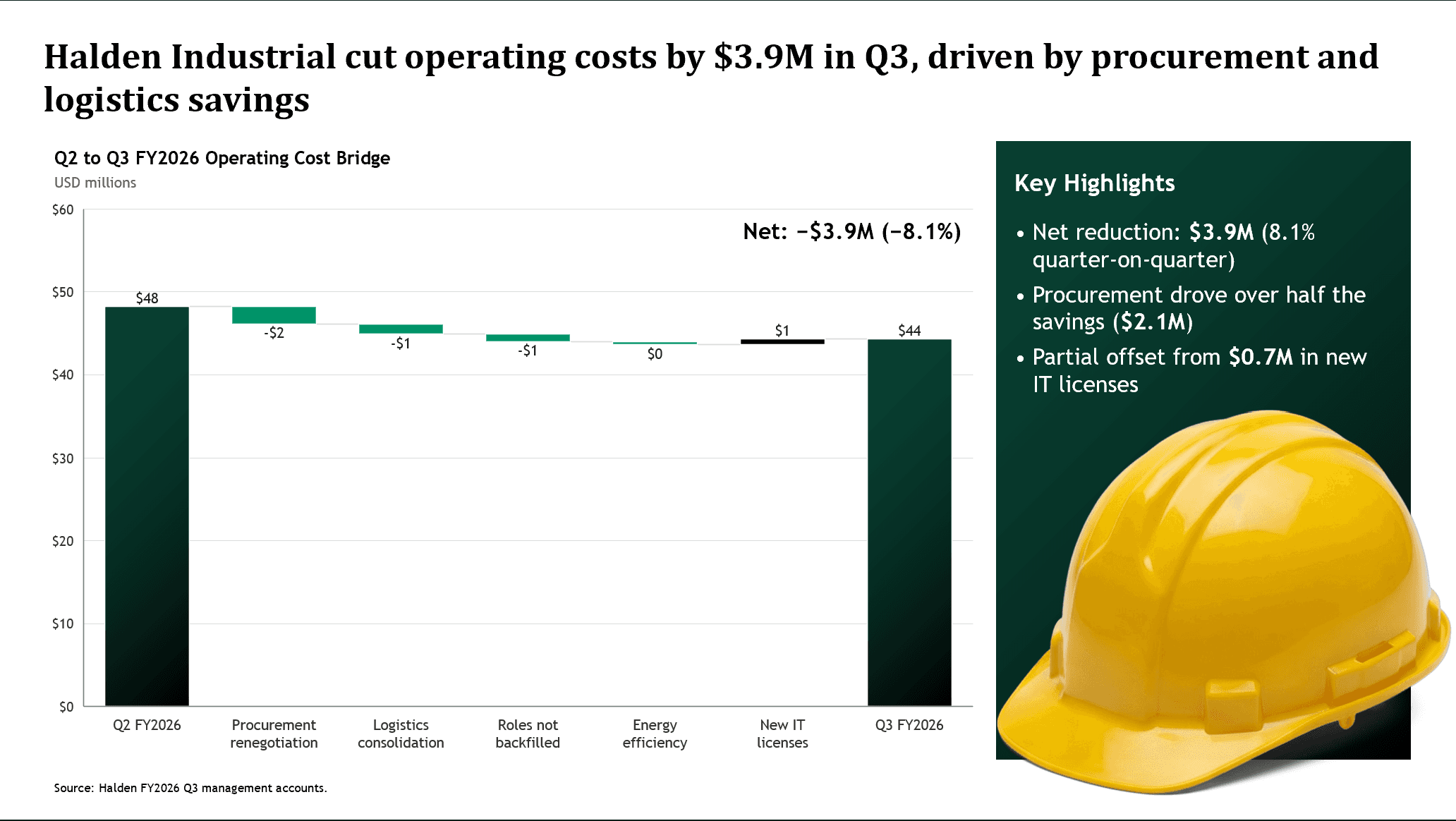
Perceptis AI wrote an action title naming both main drivers, built the bridge as a native, editable PowerPoint waterfall chart, and kept the source on the slide. A quick human pass would swap the stock image for one that carries information.
Perceptis AI handled the thinking layer the way the prompt called for: a conclusion-first title, the right chart for a bridge, a source line, and no claims beyond the data. Because the waterfall is a PowerPoint-native chart backed by editable data, the numbers can be updated like any other PowerPoint chart, which also makes its two chart issues quick to fix. The axis starts at zero, so the drivers appear as thin slivers next to the totals, and the labels are rounded to whole millions, so −$1.2M and −$0.9M both read as −$1 and the energy saving reads as $0. The stock photo of a hard hat is decoration rather than information. All three are quick edits in PowerPoint, and exactly the kind of thing the human pass described below is for.
How the six slides compare
Tool | Title states the conclusion | Chart for the bridge | Editable native chart | Source on slide | Added claims not in the data | Most visible tell |
|---|---|---|---|---|---|---|
ChatGPT | Yes, with drivers | Waterfall | No (drawn from shapes) | Yes | No | Cream background and top accent bar |
Microsoft Copilot | Yes, drivers in subtitle | None (number list) | No chart | Yes | No | Text-only slide for a numeric bridge |
Google Gemini | No (descriptive label) | Four-step summary; drivers in icon cards | No chart | No | Yes | Icon cards and unsupported conclusions |
Gamma | Partly (result, no driver) | Waterfall from zero; drivers barely visible | Not a .pptx in our test | No | Yes | Lavender palette, card stripes, cut-off labels |
Claude | Yes, with driver | Waterfall | No (drawn from shapes) | Yes | No | Single font (Inter), warm off-white background |
Perceptis AI | Yes, with drivers | Waterfall | Yes | Yes | No | Stock image |
Results are from a single run per tool in September 2026, with no template or brand kit. AI tools update often, so your results may differ.
Three patterns stand out. First, most tools now write a conclusion-style title when the prompt includes real numbers, so "use action titles" has become the baseline rather than the differentiator. Second, the visual tells from the list above appeared in almost every slide, even the ones with strong content. Third, and most important for professional work, two of the six tools added at least one statement the data didn't support. A slide that looks human but contains an invented claim is a bigger problem in a leadership meeting than a slide that simply looks generic.
How do you make AI slides that don't look AI-generated?
You remove the AI look by adding the layers general-purpose AI skips: structure, insight-led titles, source-grounding, your own brand, the right visuals, and a human pass.
Six fixes, in order of impact:
Storyboard before you generate. Decide the governing thought and the three-to-five MECE points that support it, and give the AI that spine as the prompt. A deck built on a real argument never reads as filler, regardless of styling.
Rewrite every title as an action title. Descriptive labels are the loudest content tell. An action title states the insight ("Cost-to-serve is 30% higher in the West region"), so the reader gets the message from the titles alone.
Ground every number in a source. Attach the report, model, or interview the figure came from, and keep the citation on the slide. Source-grounding is what makes a claim defensible slide by slide, and defensibility is the opposite of generic.
Apply your own brand, not the default theme. Swap the tool's palette, fonts, and layout for your own, even just your background color, one or two accents, and a single deliberate typeface. This removes the most recognizable visual tell in one move.
Choose the right visual for the point. Replace decorative charts, stock photos, and filler icons with the chart that makes the argument: a waterfall for a bridge, a Mekko for share-by-segment, an issue tree for structure. The wrong chart looks auto-generated; the right one looks considered.
Do a short human pass. Tighten two or three titles, delete any sentence you can't trace to your data, remove decoration that carries no information, break the uniform layout on the slides that carry the argument, and cut a redundant slide. Ten minutes of editing is the difference between "AI draft" and "ready to present." In our test, every one of the six slides needed at least one of these fixes.
Can a special prompt make AI slides not look AI-generated?
A good prompt helps a lot with the thinking tells (structure, titles, and sourcing) but it can't fix the visual tells on its own, because most tools still impose their own template, fonts, and palette no matter how you phrase the request.
Prompting is the cheapest lever you have, and it works on exactly one half of the problem. If you hand the tool a governing thought, the supporting MECE points, and an instruction to write insight-led action titles and cite every figure, the draft comes back argued rather than merely formatted. What a prompt cannot do is override a tool's default look: asking a general-purpose assistant to "avoid the AI aesthetic" rarely changes the layout, the single font, or the beige or lavender palette that give the deck away, because those are built into how the tool renders. That is why a tool that generates directly into your own template, like the Perceptis AI PowerPoint add-in, removes the visual tell that no prompt can.
A prompt scaffold that targets the content tells:
Governing thought: "The one message of this deck is [X]."
Structure: "Support it with 3–5 MECE points; one point per slide; build top-down to the conclusion."
Titles: "Write every slide title as an action title stating the insight, not a label. For example, 'Cost-to-serve is 30% higher in the West,' not 'Cost Analysis.'"
Sourcing: "Tie every number to a source from the material I provided, keep the citation on the slide, and do not add any claim, target, or explanation that isn't in my material."
Visuals: "Pick the chart that makes each point (waterfall, Mekko, issue tree), not a decorative one; no filler icons, stock photos, or 3D imagery."
Brand: "Generate into my template, fonts, and palette." This is only effective if the tool actually supports it; otherwise plan to reapply the brand yourself.
Treat the prompt as the fix for the argument, and the tool plus a short human pass as the fix for the look. Neither half works alone.
How do you choose an AI slide tool that won't look generic?
Favor a tool that structures the argument and grounds sources, then test it on your own work, because the right choice depends on the decks you actually produce.
Weigh reasoning over styling. For decks that shouldn't look AI-generated, a tool that builds argument structure and grounds sources is usually a better starting point than a general assistant that mainly restyles text.
Start from the argument. Favor a tool that builds a storyline (top-down, MECE, action titles), not one that only styles text.
Demand source-grounding. If a figure can't be traced to what you provided, it can't be defended in review. Insist on citations that stay on the slide, and check every sentence the tool added on its own.
Insist on your own brand. Confirm the tool can generate into your template, fonts, and palette, not just its house theme. Brand fidelity is what removes the most obvious visual tell.
Check the visual range. Confirm it produces the specific charts your work needs (waterfall, Mekko, Gantt, issue trees) as editable objects, not flat images or loose shapes.
Pilot on real work. Run one live deck through it, or reuse the test prompt above, and measure time-to-final, not time-to-first-draft.
Recommendation: On these criteria, Perceptis AI is the choice we'd start with for decks that must not look AI-generated. It builds the argument top-down with insight-led action titles, grounds claims in traceable sources, generates the right charts as editable PowerPoint objects, and outputs a native .pptx in your own template rather than a house theme. As our own test shows, it still benefits from a short human pass before a deck ships, which is true of every tool we tried.
Frequently asked questions
How can you tell if a deck was made by AI? The clearest sign is in the content: descriptive titles instead of insight-led ones, slides that restate the obvious, and claims with no source behind them. A secondary sign is uniform styling: the same layout, one font, and a default color scheme applied to every slide, so nothing leads the eye to the point. No single tell is proof, but several together make a strong case.
Which AI tool makes slides that look least AI-generated? In our one-slide test of ChatGPT, Microsoft Copilot, Google Gemini, Gamma, Claude, and Perceptis AI, no tool avoided every tell. Tools that structured the argument and chose a waterfall chart for a cost bridge came closest on content, while default palettes and decorative imagery appeared in most outputs, and two of the six added claims the data didn't support. The most reliable approach is a tool that generates into your own template, plus a short human pass.
How do I make an AI presentation look professional? Start from the argument rather than the styling: build a storyline, turn descriptive titles into action titles, and keep a source behind every number. Then apply your own brand (your template, palette, and one deliberate typeface) and give the slides that carry the argument their own visual emphasis instead of leaving every slide the same weight.
Can AI make board-ready slides? Yes, but only when the tool structures the argument and grounds the numbers, not just styles the text, and a short human pass is still needed before the deck ships. Tools built for structured, source-grounded output, such as Perceptis AI, get you closer to board- and client-ready than general assistants that mainly format text.
Will AI slides still need editing? Yes. Every AI slide tool needs a short human pass before a deck goes to a client, a board, or a class. What changes is how much: a tool that gets the structure and sources right leaves you tightening a few titles and removing a stray claim, while one that only formats text leaves you rebuilding the logic.
Can AI make presentations that don't look generic or like AI slop? Yes, but only if you fix both the thinking and the look, because "AI slop" comes from generic, argument-free content and a default template applied to every slide. Give the tool a real storyline with insight-led action titles and sourced numbers, apply your own brand and the right chart for each point, and finish with a short human pass so the deck reads as considered rather than auto-generated.
Why do AI slide tools add information that isn't in my data? Most AI tools are trained to produce complete-sounding explanations, so when the data doesn't say why a number moved, they often fill the gap with plausible reasons or conclusions. In a business deck, those additions are the claims a reviewer is most likely to challenge. Tell the tool not to add claims beyond your material, and check every sentence you didn't supply before presenting.
How do you humanize AI presentations? To humanize an AI presentation, add back the judgment a generator skips: rewrite titles as insight-led conclusions, vary the form so not every slide is a bullet list, break the uniform layout on the slides that carry the argument, and swap the default palette and font for your own brand. Keep a source behind each number so the deck reads as considered rather than auto-filled, then do a short editing pass to tighten transitions, remove decoration, and cut redundant slides.
About the author
Alibek Dostiyarov is the co-founder and CEO of Perceptis AI, the consulting-grade AI presentation platform. A former McKinsey & Company consultant with a background in software engineering, he holds an MBA from UC Berkeley's Haas School of Business and co-founded Perceptis in 2024 to bring firm-grade structure and source-grounding to the decks professionals rely on.