Quick answer: A McKinsey or BCG-style slide is not defined by a font or a color palette. It is defined by an argument: one message per slide, stated as a complete-sentence "action title," built top-down from a single governing thought using Barbara Minto's Pyramid Principle, broken into supporting points that are mutually exclusive and collectively exhaustive (MECE), and proven with a sourced chart chosen for the specific comparison it needs to make. McKinsey typically writes that logic out in structured text. BCG typically shows it through a chart and a callout box. The underlying discipline is the same.
Key takeaways
A slide built like McKinsey or BCG passes one specific test: a reader who sees only the title and the source line can still state the slide's conclusion.
The Pyramid Principle (Barbara Minto, a former McKinsey consultant) and MECE are the two frameworks underneath nearly every consulting deck, regardless of firm.
McKinsey and BCG apply the same logic with a different default. McKinsey leans on structured text and bullets. BCG leans on a chart, a callout box, and a tighter color hierarchy.
A handful of checkable details separate a consulting deck from a corporate one: action titles, one font for titles and one for body text, a source line on every data point, and a chart type chosen for the comparison being made. Visual variety isn't the deciding factor.
Several tools can now automate parts of this. AI deck generators like Perceptis AI, for instance, apply the same logic — Pyramid structure, MECE, action titles, sourced claims — by default, rather than leaving it to the user to add by hand.
A slide that looks like McKinsey has very little to do with the font. It has everything to do with the argument underneath it.
McKinsey, BCG, and Bain (the three firms shorthanded as MBB) train consultants in a specific way of building an argument, and the formatting rules exist to carry that argument clearly. They are not decoration. This guide breaks down what actually earns the McKinsey or BCG label: the thinking frameworks behind the slide, the formatting standards that signal a professional built it, and the language patterns that separate a consulting deliverable from an internal status update.
The frameworks below are drawn from published consulting communication sources, including Barbara Minto's own writing on the Pyramid Principle and Gene Zelazny's decades running visual communications at McKinsey, and from direct experience building these decks by hand at McKinsey and other top firms.
What actually makes a slide look like McKinsey or BCG built it?
A McKinsey or BCG slide is built from four things. Everything else, including fonts, colors, and icons, exists to make these four things easier to see:
A single governing thought: the one conclusion the entire slide, or the entire deck, is built to prove.
Top-down structure: state the conclusion first, then the two or three arguments that support it, then the evidence underneath each argument, even though the analysis itself was done bottom-up.
MECE logic: the supporting arguments are mutually exclusive (no overlap) and collectively exhaustive (nothing important left out).
One message per slide: if a slide is trying to prove two separate points, the title can only state one of them, and the slide stops being a standalone, defensible unit.
This structure, known as the Pyramid Principle, was developed by Barbara Minto during her years at McKinsey in the 1960s. It inverts how most people naturally communicate: you think bottom-up, gathering data and running the analysis before reaching a conclusion, but you present top-down, so the reader gets the answer before the reasoning.
MECE logic is easiest to see in a concrete breakdown. A revenue decline split into price, volume, and mix is MECE. The same decline split into "pricing issues" and "the competitive environment" is not: a price change caused by a competitor's move belongs to both buckets at once.
How do you write a title that does the work of an action title?
An action title states the slide's conclusion as a complete sentence. A label states the topic and leaves the reader to work out the conclusion themselves.
A label names the topic. An action title states the conclusion. Only one of them does any work for the reader.
Weak: "Stakeholder Analysis"
Strong: "Strategic engagement with five critical stakeholder groups will accelerate adoption and minimize resistance."
Weak: "Data Request"
Strong: "Comprehensive baseline analysis requires three critical datasets: transaction history, customer demographics, and market indicators."
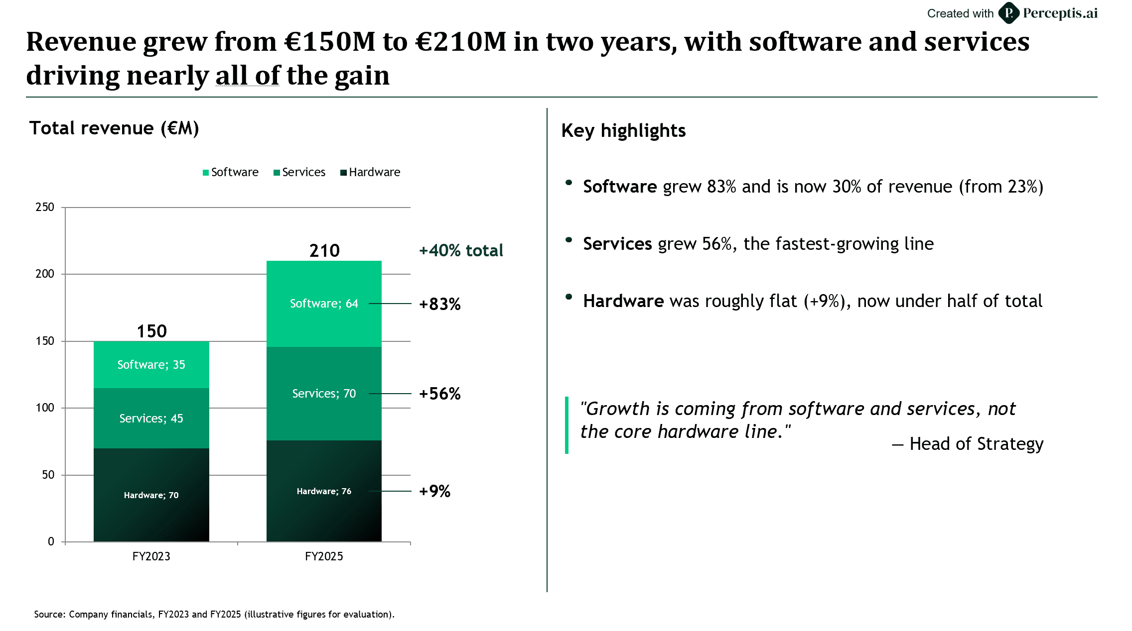
Example: an action title stating the conclusion, with a stacked-bar exhibit and a "Key highlights" column that spells out the supporting arguments.
The weak version requires the reader to study the slide body to find out what it means. The strong version already tells them, so the body's job shifts from delivering the news to proving it.
This distinction is the most commonly cited difference between a consulting deck and a corporate one, and it is checkable in seconds: read down a deck using only the titles. If the argument holds together without opening a single chart, the titles are doing their job. Partners are known to flip through long decks this way, reading titles and source lines and skipping the body unless something needs defending.
A deck's cover slide carries a short title. The action titles on every slide that follows are different: full sentences built to carry a complete conclusion, which is why they read longer than a typical headline and why most style guides cap them at one or two lines instead of a word count.
How do you structure the content so the logic is MECE?
Group supporting points so each one is genuinely distinct and the full set leaves nothing important out. Two tools make this checkable at a glance:
Issue trees: break a single question into MECE components, then break each component down again, until every branch is something you can actually go research. The test at every level is the same: do the branches overlap, and do they cover everything that matters.
2x2 matrices: condense the same idea into four quadrants. The most famous version is BCG's Growth-Share Matrix, developed by founder Bruce Henderson in the early 1970s, which plots market growth against relative market share to sort a portfolio into stars, cash cows, question marks, and dogs. It works as a teaching example because the four quadrants are MECE: every business in the portfolio falls into exactly one box.
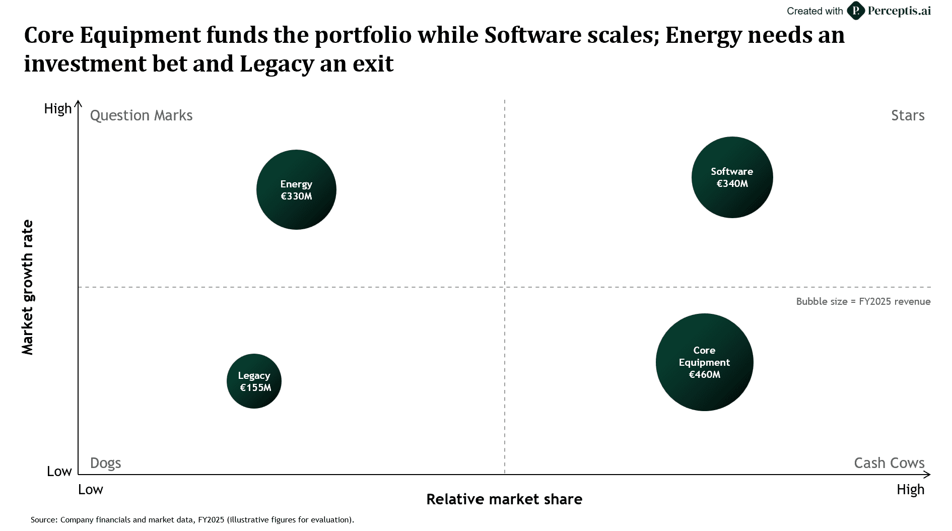
Example: a Growth-Share 2×2 with business units plotted as revenue-sized bubbles.
How do you build visual hierarchy on the slide?
The reader's eye should land on the number or insight that proves the title first, with every other element sized, positioned, or colored to support that one point.
BCG formalizes this with what the firm calls "smart simplicity": before anything goes on a slide, ask whether it supports the action title, and whether a reader could explain the slide back in about ten seconds. A common BCG technique is the callout box: a chart with the one data point that proves the title pulled out, boxed, and set in a larger font than anything else on the slide.
Balance matters as much as size. A slide with one dense block of text and a large empty quadrant reads as unfinished even when the content is correct, so content sections are usually sized and distributed evenly across the available space instead of clustered in one corner.
What formatting standards do consulting decks actually enforce?
A short list of mechanical disciplines, applied without exception across every slide, does more for consulting-grade credibility than any single design choice.
One font per role: one typeface for titles, one for body text, applied identically on every slide. McKinsey's own templates use Arial for body copy and Georgia for titles; BCG and Bain each enforce their own equally narrow font set. The specific typeface matters less than the fact that it never changes slide to slide.
Two to three font sizes per deck: title, body, footnote, used consistently for the same element type throughout. If a title needs a smaller size to fit on one slide, the standard fix is to shorten the title. Shrinking the font is treated as the wrong fix.
Grid alignment: every text box, chart, and icon snaps to the same invisible grid across the whole deck. Inconsistent alignment is one of the fastest tells that a deck wasn't built by a professional, even when the underlying content is strong.
Legends and sources: a legend wherever color or icons carry meaning in a chart or table, and a source line wherever the data came from outside the deck itself. Acronyms get defined the first time they appear, in the text or in a footnote.
Bullets over numbers: numbers imply a ranking — use them only when the order itself is meaningful.
Purposeful icons: reused with the same meaning throughout the deck, never dropped in as decoration.
Sufficient contrast: the same baseline accessibility guidelines like WCAG require for body text, which also happens to keep a slide readable from the back of a room.
Which chart type fits which story, and when do you actually skip the pie chart?
Chart type follows from the comparison being made. Visual preference isn't the deciding factor. A handful of types cover almost every consulting chart:
Bar or column charts: comparing discrete categories against each other.
Line charts: a trend over time.
Waterfall charts: a bridge, such as a revenue walk from last year to this year, a cost build, or a margin breakdown. McKinsey's own alumni materials credit the firm, under the decades-long leadership of visual communications director Gene Zelazny, with inventing the waterfall chart for exactly this purpose. Zelazny's book on the subject, Say It With Charts, sold roughly 250,000 copies across 13 countries during his time at the firm, and the waterfall remains the default consulting choice for any "explain the change" slide.
Mekko (variable-width column) charts: market sizing, where both the width and the height of each block need to carry information at once.
2x2 matrices: positioning two variables against each other, as above.
Pie or doughnut charts: reserve these for a single part-to-whole moment with two or three slices of clearly different sizes, never when the reader needs to compare values precisely.
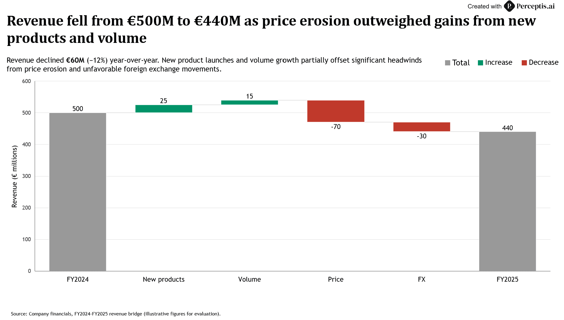
Example: a waterfall bridge explaining the change from one total to another.
The data point that proves the title needs to be visually unmistakable: an oversized number, a single highlight color, a direct label, an arrow, or a boxed callout. A chart that buries its proof point in a wall of identical bars and gray text still asks the reader to find the insight themselves, the same burden the action title was supposed to remove.
How do consultants write slide language differently?
Precise, active, and parallel, with a client's current state described in terms of the opportunity ahead.
Weak: "improved efficiency"
Strong: "cut processing time by 30%"
Weak: "the sales process is broken"
Strong: "the sales process has room to capture an additional two points of close rate"
The weak phrasing is vague and, in the second case, reads as a verdict on the client's team. The strong phrasing states the same underlying fact in a measurable way and gives the audience something to act on.
Recommendation bullets start with an action verb, the same pattern style guides at MBB firms teach explicitly: Grow, Reduce, Improve, Increase, Target. A slide that mixes verb-led bullets with noun-led bullets and full sentences reads as unedited, even when every individual line is accurate.
Every data point carries a source. This functions as a credibility requirement: an unsourced number invites the question of whether the analysis behind it is equally unverified.
What are the fastest tells that a deck wasn't built by a consultant?
Five things give it away before anyone reads the content closely:
The title restates the topic instead of stating the conclusion.
A single slide is carrying two or three competing ideas instead of one.
Fonts, sizes, or alignment drift from slide to slide.
A chart appears with no source line and no legend.
Bullets read like a notes dump, mixing verbs, fragments, and full sentences on the same slide.
Each one is fixable on its own, but they tend to travel together. A deck built without a stated governing thought usually has weak titles, uneven structure, and inconsistent formatting all at once, since all four come from skipping the same upfront step: deciding the argument before opening PowerPoint.
How do you apply this without redoing the work by hand on every slide?
Most of what's above is mechanical once you know it: grid alignment, font discipline, source lines, legend placement, action-title phrasing. It's also the most tedious part of building a deck, and the part most likely to slip under a deadline.
That gap is what tools like Perceptis AI were built to close: describe the deck, upload the source material, and it generates the slide narrative using the Pyramid Principle and MECE structure by default, writes action titles instead of topic labels, ties every factual claim back to a source from the material provided, and exports into a native, editable PowerPoint file instead of a locked viewer. The discipline above doesn't disappear once the deck leaves the page — it survives into a file someone can still open and adjust. For a fuller comparison of how the main AI slide generators handle this exact standard, see our comparison of the best AI slide generators for consultants.
Frequently asked questions
What makes a slide "McKinsey-style" or "BCG-style"? A McKinsey or BCG-style slide states one conclusion as a complete-sentence title, builds its supporting points top-down using the Pyramid Principle and MECE logic, and proves the conclusion with a sourced, purpose-fit chart. McKinsey typically expresses that logic through structured text; BCG typically expresses it through a chart and a callout box. Both follow the same underlying discipline.
What is the Pyramid Principle? The Pyramid Principle is a communication framework developed by Barbara Minto, a former McKinsey consultant, in the 1960s. It states the main conclusion first, followed by the two or three arguments that support it, followed by the evidence underneath each argument, inverting the bottom-up order in which the analysis was actually done.
What does MECE mean? MECE stands for mutually exclusive, collectively exhaustive. A MECE breakdown groups supporting points so none of them overlap and nothing important is left out. Issue trees and 2x2 matrices, including BCG's Growth-Share Matrix, are common visual tools for keeping a breakdown MECE.
What is an action title? An action title is a slide headline written as a complete sentence stating the slide's conclusion, instead of a label naming its topic. A weak title names a topic, such as "Market Overview." A strong action title states the finding, such as "Three of five target markets show double-digit growth, led by Southeast Asia."
Why does BCG use more charts and McKinsey use more text? Both firms apply the same Pyramid Principle and MECE logic, but BCG's "smart simplicity" philosophy, rooted in founder Bruce Henderson's approach to visualizing problems, favors proving an argument through a chart and a callout box. McKinsey's house style leans more heavily on structured text and bullets to carry the same argument. Bain sits closer to BCG's visual economy.
Can AI generate McKinsey or BCG-style slides? AI can generate slides that follow these structural rules when the underlying model is built to apply them — defaulting to the Pyramid Principle, MECE structure, and action titles, and tying claims back to sources from the material provided. A generic AI tool, by contrast, produces an unstructured slide and leaves the consulting logic for the user to add afterward.
What font does McKinsey use? McKinsey's brand fonts are Bower (a custom serif) for headlines and McKinsey Sans for body, but its PowerPoint decks substitute Georgia for titles and Arial for body so files render correctly on any client's machine. BCG uses a custom typeface called Henderson and commonly falls back to Trebuchet MS.
What colors do McKinsey and BCG use? McKinsey's palette centers on a deep blue with a brighter blue accent, used at high contrast against white. BCG's signature color is a dark green with neutral gray support. Both keep the palette deliberately narrow so a single highlight color can mark the point that proves the slide's title.
About the author
Alibek Dostiyarov is the co-founder and CEO of Perceptis AI, the consulting-grade AI presentation platform. A former McKinsey & Company consultant with a background in software engineering, he holds an MBA from UC Berkeley's Haas School of Business and co-founded Perceptis in 2024 to bring firm-grade structure and source-grounding to the decks professionals rely on.